Class 9: Maths Chapter 23 solutions. Complete Class 9 Maths Chapter 23 Notes.
Contents
RD Sharma Solutions for Class 9 Maths Chapter 23–Graphical Representation of Statistical Data
RD Sharma 9th Maths Chapter 23, Class 9 Maths Chapter 23 solutions
Exercise 23.1 Page No: 23.7
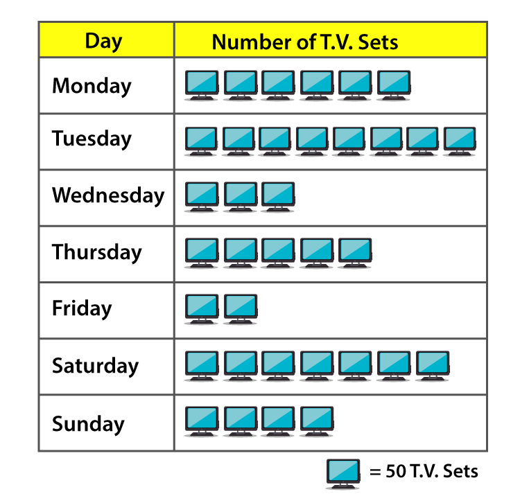
Question 1: The following table shows the daily production of T.V. sets in an industry for 7 days of a week.
| Day | Monday | Tuesday | Wednesday | Thursday | Friday | Saturday | Sunday |
| Number of tv sets | 300 | 400 | 150 | 250 | 100 | 350 | 200 |
Represent the above information by a pictograph.
Solution:
The given information can be represented using a pictograph as below:
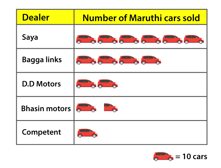
Question 2: The following table shows the number of Maruti cars sold by five dealers in a particular month:
| Dealer | saya | Bagaa links | DD motors | Bhasin Motors | competent |
| cars sold | 60 | 40 | 20 | 15 | 10 |
Represent the above information by a pictograph.
Solution:
The given information can be represented using a pictograph as below:
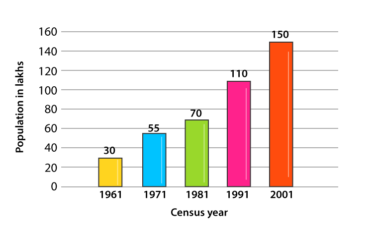
Question 3: The population of Delhi State in different census years is as given below:
| Cenus year | 1961 | 1971 | 1981 | 1991 | 2001 |
| Population in lakhs | 30 | 55 | 70 | 110 | 150 |
Represent the above information with the help of a bar graph.
Solutions:
Let us consider the horizontal and vertical axes represent the years and population in lakhs respectively.
The heights of the rectangles are proportional to the population in lakhs.
Bar Graph:
Question 4: Read the bar graph shown below and answer the following questions:
(i) What is the information given by the bar graph?
(ii) How many tickets of Assam State Lottery were sold by the agent?
(iii) Of which state, were the maximum number of tickets sold?
(iv) State whether true or false.
The maximum number of tickets sold is three times the minimum number of tickets sold.
(v) Of which state were the minimum numbers of tickets sold?

Solution:
(i) Bar graph represents the number of tickets of different state lotteries sold by an agent on a day.
(ii) Number of tickets of Assam State Lottery were sold by the agent = 40.
(iii) Maximum numbers of tickets were sold is 100, in the state Haryana.
(iv) Maximum number of tickets were sold is 100, in the state Haryana. Minimum number of tickets were sold is 20, in the state Rajasthan.
It is clear that 100 are equal to 5 times of 20.
Hence, the statement is false.
(v) The minimum numbers of tickets were sold is 20, in the state Rajasthan.
Question 5: Study the bar graph representing the number of persons in various age groups in a town shown in figure. Observe the bar graph and answer the following questions:
(i) What is the percentage of the youngest age-group persons over those in the oldest age group?
(ii) What is the total population of the town?
(iii) What is the number of persons in the age-group 60-65?
(iv) How many persons are more in the age-group 10-15 than in the age group 30-35?
(v) What is the age-group of exactly 1200 persons living in the town?
(vi) What is the total number of persons living in the town in the age-group 50-55?
(vii) What is the total number of persons living in the town in the age-groups 10-15 and 60-65?
(vii) Whether the population in general increases, decreases or remains constant with the increase in the age-group.

Solution:
(i) Youngest age-group is 10-15 years
The number of persons belonging to this group = 1400
The oldest age-group is 70-75 years and
The number of persons belonging to this group = 300
Now,
The percentage of youngest age-group persons over those in the oldest group is as below:
1400/300 × 100 = 1400/3
(ii) Population of the town = 300 + 800 + 900 + 1000 + 1100 + 1200 + 1400 = 6700
(iii) Number of persons in the age group 60 – 65 = 800.
(iv) Number of persons in the age group 10 – 15 = 1400
Number of persons in the age group 30-35 = 1100.
Hence the number of more persons in the age group 10 – 15 than the group 30-35 is 1400 — 1100 = 300.
(v) Age group of 1200 persons living in the town is 20 – 25.
(vi) Total number of persons living in the town in the age-group 50 – 55 is 900.
(vii) Total number of persons living in the town in the age-groups 10 -15 and 60 – 65 is 1400 + 800 = 2200.
(viii) We have observed that, the height of the bars decreases as the age-group increases. Hence, the population decreases with the increases in the age-group.
Exercise 23.2 Page No: 23.23
Question 1: Explain the reading and interpretation of bar graphs.
Solution: A bar graph consists a sequence of vertical or horizontal bar lines or rectangles. Bar lines may be either horizontal or vertical. We can easily collect the information and conclude various observations from a given bar graph which is referred as the interpretation of the bar graph.
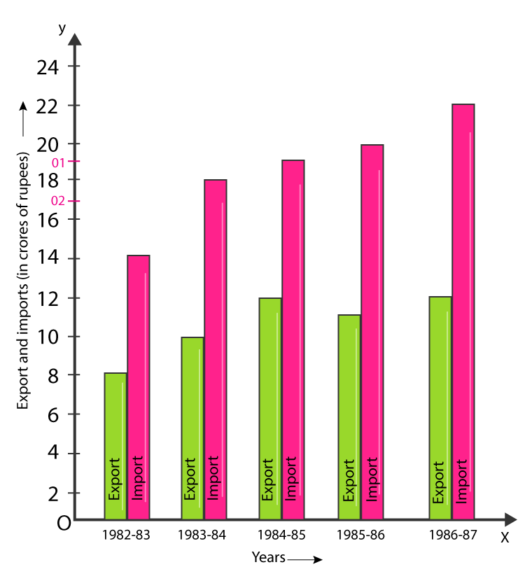
Question 2: Read the following bar graph and answer the following questions:
(i) What information is given by the bar graph?
(ii) In which year the export is minimum?
(iii) In which year the import is maximum?
(iv) In which year the difference of the values of export and import is maximum?
Solution:
(i) The bar graph represents the import and export (in 100 Crores of rupees) from 1982-83 to 1986-87.
(ii) 1982-83
(iii) 1986-87
(iv) 1986-87
Question 3: The following bar graph shows the results of an annual examination in a secondary school. Read the bar graph given below, and choose the correct alternative in each of the following:

(i)The pair of classes in which the results of boys and girls are inversely proportional are:
(a) VI, VIII (b) VI, IX (c) VII, IX (d) VIII, X
(ii) The class having the lowest failure rate of girls is:
(a) VI (b) X (c) IX (d) VIII
(iii) The class having the lowest pass rate of students is:
(a) VI (b) VII (c) VIII (d) IX
Solution:
(i) Option (b) is correct.
(ii) Option (a) is correct.
(iii) Option (b) is correct.
The sum of the heights of the bars for boys and girls in class VII = 95 + 40 = 135 (which is minimum)
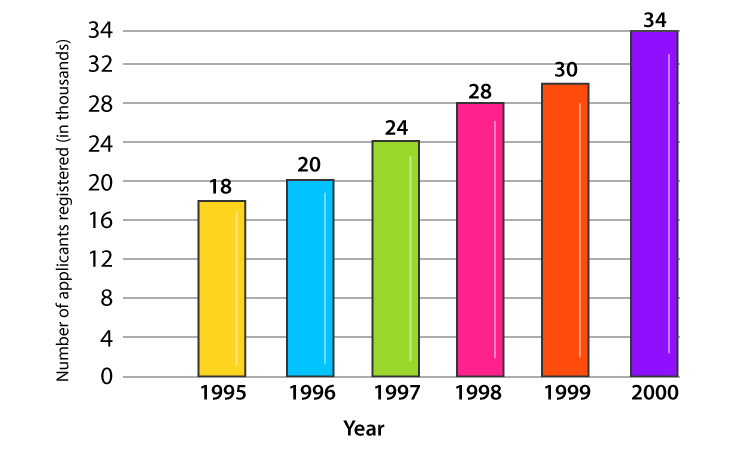
Question 4: The following data gives the number (in thousands) of applicants registered with an Employment Exchange during 1995-2000:

Construct a bar graph to represent the above data.
Solution:
Let us consider that the horizontal and vertical axes represent the years and the number of applicants registered in thousands respectively.
Bar Graph:
Question 5: The production of saleable steel in some of the steel plants of our country during 1999 is given below:

Construct a bar graph to represent the above data on a graph paper by using the scale 1 big divisions = 20 thousand tonnes.
Solution:
Let us consider that the horizontal and vertical axes represent the plants and the production in thousand tonnes respectively.

Question 6: The following table gives the route length (in thousand kilometres) of the Indian Railways in some of the years:

Represent the above data with the help of a bar graph.
Solution:
Let us consider that the horizontal and vertical axes represent the years and the route lengths in thousand km respectively.
Bar Graph:

Exercise 23.3 Page No: 23.41
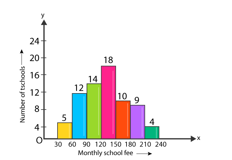
Question 1: Construct a histogram for the following data:

Solution:
Let us consider that the horizontal and vertical axes represent the monthly school fees and the number of schools respectively. Construct rectangles with class-intervals as bases and respective frequencies as heights as below.
Histogram:
Question 2: The distribution of heights (in cm) of 96 children is given below. Construct a histogram and a frequency polygon on the same axes.

Solution:
Let us consider that the horizontal and vertical axes represent the height (in cm) and the number of children respectively. Construct rectangles with class-intervals as bases and respective frequencies as heights as below.

Question 3: The time taken, in seconds, to solve a problem by each of 25 pupils is as follows:
16, 20, 26, 27, 28, 30, 33, 37, 38, 40, 42, 43, 46, 46, 46, 48, 49, 50, 53, 58, 59, 60, 64, 52, 20
(a) Construct a frequency distribution for these data, using a class interval of 10 seconds.
(b) Draw a histogram to represent the frequency distribution.
Solution:
Arrange raw data into ascending order:
16, 20, 20, 26, 27, 28, 30, 33, 37, 38, 40, 42, 43, 46, 46, 46, 48, 49, 50, 52, 53, 58, 59, 60, 64
(a) Frequency distribution for the given data, using a class interval of 10 seconds.
| Class Interval | Frequency | |
| 10-20 | 16 | 1 |
| 20-30 | 20, 20, 26, 27, 28 | 5 |
| 30-40 | 30, 33, 37, 38 | 4 |
| 40-50 | 40, 42, 43, 46, 46, 46, 48, 49 | 8 |
| 50-60 | 50, 52, 53, 58, 59 | 5 |
| 60-70 | 60, 64 | 2 |
(b)
Consider horizontal and vertical axes represent the seconds and frequency respectively. Frequencies are the heights of rectangles.

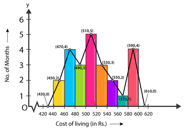
Question 4: Draw, in the same diagram, a histogram and a frequency polygon to represent the following data which shows the monthly cost of living index of a city in a period of 2 years:

Solution:
Consider horizontal as cost of living (in Rs.) and vertical axis represent the number of months.
Histogram and a frequency polygon:
RD Sharma Solutions for Class 9 Maths Chapter 23: Download PDF
RD Sharma Solutions for Class 9 Maths Chapter 23–Graphical Representation of Statistical Data
Chapterwise RD Sharma Solutions for Class 9 Maths :
- Chapter 1–Number System
- Chapter 2–Exponents of Real Numbers
- Chapter 3–Rationalisation
- Chapter 4–Algebraic Identities
- Chapter 5–Factorization of Algebraic Expressions
- Chapter 6–Factorization Of Polynomials
- Chapter 7–Introduction to Euclid’s Geometry
- Chapter 8–Lines and Angles
- Chapter 9–Triangle and its Angles
- Chapter 10–Congruent Triangles
- Chapter 11–Coordinate Geometry
- Chapter 12–Heron’s Formula
- Chapter 13–Linear Equations in Two Variables
- Chapter 14–Quadrilaterals
- Chapter 15–Area of Parallelograms and Triangles
- Chapter 16–Circles
- Chapter 17–Construction
- Chapter 18–Surface Area and Volume of Cuboid and Cube
- Chapter 19–Surface Area and Volume of A Right Circular Cylinder
- Chapter 20–Surface Area and Volume of A Right Circular Cone
- Chapter 21–Surface Area And Volume Of Sphere
- Chapter 22–Tabular Representation of Statistical Data
- Chapter 23–Graphical Representation of Statistical Data
- Chapter 24–Measure of Central Tendency
- Chapter 25–Probability
About RD Sharma
RD Sharma isn’t the kind of author you’d bump into at lit fests. But his bestselling books have helped many CBSE students lose their dread of maths. Sunday Times profiles the tutor turned internet star
He dreams of algorithms that would give most people nightmares. And, spends every waking hour thinking of ways to explain concepts like ‘series solution of linear differential equations’. Meet Dr Ravi Dutt Sharma — mathematics teacher and author of 25 reference books — whose name evokes as much awe as the subject he teaches. And though students have used his thick tomes for the last 31 years to ace the dreaded maths exam, it’s only recently that a spoof video turned the tutor into a YouTube star.
R D Sharma had a good laugh but said he shared little with his on-screen persona except for the love for maths. “I like to spend all my time thinking and writing about maths problems. I find it relaxing,” he says. When he is not writing books explaining mathematical concepts for classes 6 to 12 and engineering students, Sharma is busy dispensing his duty as vice-principal and head of department of science and humanities at Delhi government’s Guru Nanak Dev Institute of Technology.
