
Class 8: Maths Chapter 24 solutions. Complete Class 8 Maths Chapter 24 Notes.
RD Sharma Solutions for Class 8 Maths Chapter 24–Data Handling - II (Graphical Representation of Data as Histogram)
RD Sharma 8th Maths Chapter 24, Class 8 Maths Chapter 24 solutions
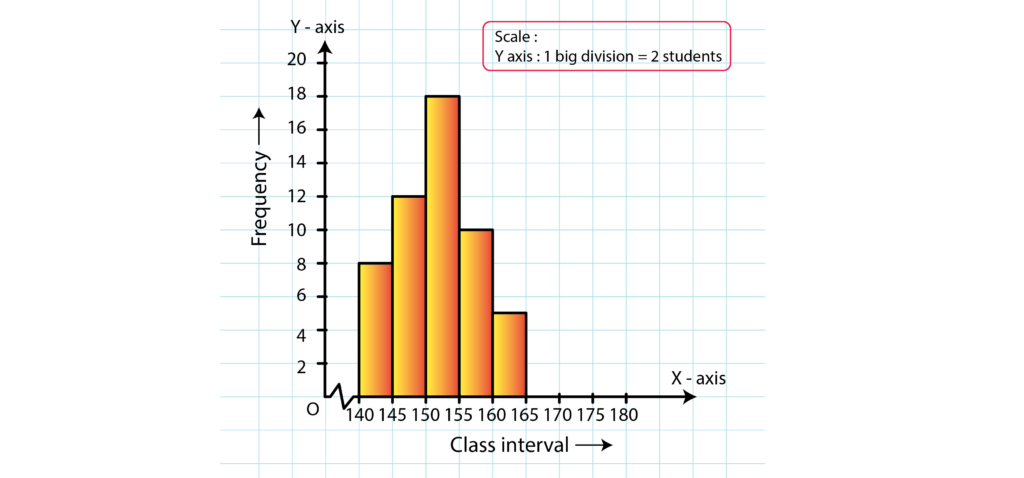
1. Given below is the frequency distribution of the heights of 50 students of a class:
| Class Interval | 140 – 145 | 145 – 150 | 150 – 155 | 155 – 160 | 160 – 165 |
| Frequency | 8 | 12 | 18 | 10 | 5 |
Draw a histogram representing the above data.
Solution:
The class limits are represented along the x-axis on a suitable scale and the frequencies are represented along the y-axis on a suitable scale. Taking class intervals as bases and the corresponding frequencies as heights, the rectangles can be constructed to obtain the histogram of the given frequency distribution as shown in the figure below:
2. Draw a histogram of the following data:
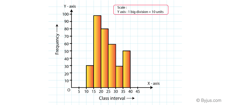
| Class Interval | 10 – 15 | 15 – 20 | 20 – 25 | 25 – 30 | 30 – 35 | 35 – 40 |
| Frequency | 30 | 98 | 80 | 58 | 29 | 50 |
Solution:
The class limits are represented along the x-axis and the frequencies are represented along the y-axis on a suitable scale. Taking class intervals as bases and the corresponding frequencies as heights, the rectangles can be drawn to obtain the histogram of the given frequency distribution. The histogram is shown below:
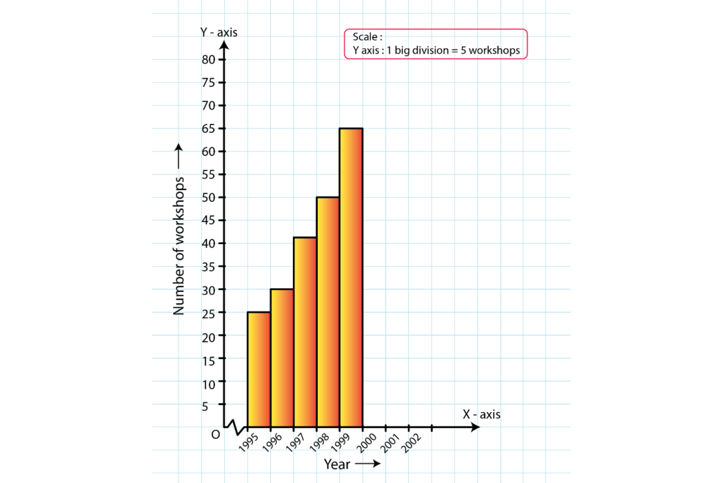
3. Number of workshops organized by a school in different areas during the last five years are as follows:
| Years | No: of Workshops |
| 1995 – 1996 | 25 |
| 1996 – 1997 | 30 |
| 1997 – 1998 | 42 |
| 1998 – 1999 | 50 |
| 1999 – 2000 | 65 |
Draw a histogram representing the above data:
Solution:
The class limits are represented along the x-axis and the frequencies are represented along the y-axis on a suitable scale. Taking class intervals as bases and the corresponding frequencies as heights, the rectangles can be constructed to obtain histogram for the given frequency. The histogram is shown below:
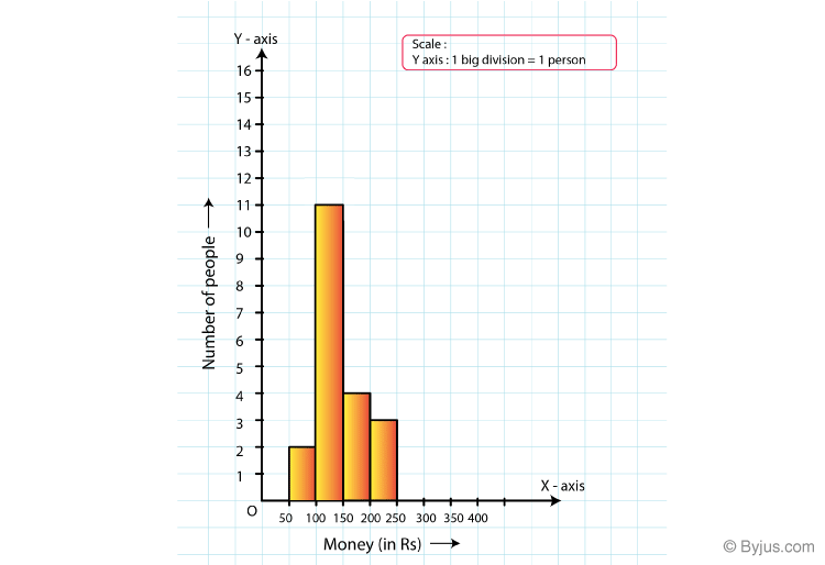
4. In a hypothetical sample of 20 people the amounts of money with them were found to be as follows:
114, 108, 100, 98, 101, 109, 117, 119, 126, 131, 136, 143, 156, 168, 182, 195, 207, 219, 235, 118.
Draw the histogram of the frequency distribution (taking one of the class intervals as 50-100).
Solution:
We first prepare the frequency table for the class intervals 50−100, 100−150,…, 200−250, as shown below:
| Class Interval | Frequency |
| 50 – 100 | 2 |
| 100 – 150 | 11 |
| 150 – 200 | 4 |
| 200 – 250 | 3 |
The class limits are represented along the x-axis and the frequencies along the y-axis on a suitable scale. Taking the class intervals as bases and the corresponding frequencies as heights, the rectangles can be drawn to obtain the histogram of the given frequency distribution. The histogram is shown below:
5. Construct a histogram for the following data:
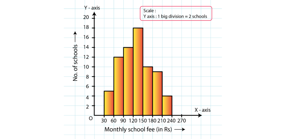
| Monthly School Fee(in Rs) | 30-60 | 60-90 | 90-120 | 120-150 | 150-180 | 180-210 | 210-240 |
| No: of Schools | 5 | 12 | 14 | 18 | 10 | 9 | 4 |
Solution:
The class limits are represented along the x-axis and the frequencies along the y-axis on a suitable scale. Taking class intervals as bases and corresponding frequencies as heights of the rectangles, the histogram of the given data can be obtained as shown in the figure below:
6. Draw a histogram for the daily earnings of 30 drug stores in the following table:
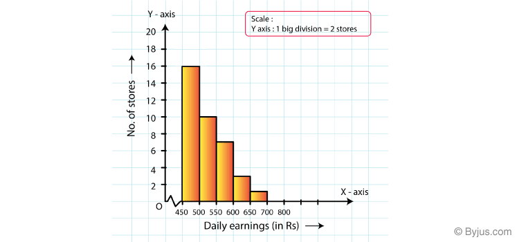
| Daily Earnings(in Rs) | 450 – 500 | 500 – 550 | 550 – 600 | 600 – 650 | 650 – 700 |
| No: of Stores | 16 | 10 | 7 | 3 | 1 |
Solution:
The class limits are represented along the x-axis and the frequencies along the y-axis on a suitable scale. Taking class intervals as bases and the corresponding frequencies as heights, the rectangles can be drawn to obtain the histogram of the given frequency distribution. The histogram is given below:
7. Draw a histogram to represent the following data:
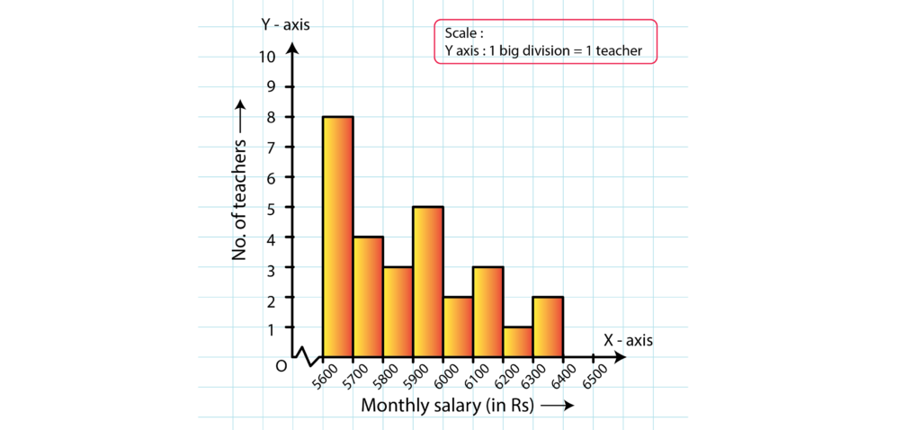
| Monthly Salary (in Rs) | No: of Teachers |
| 5600 – 5700 | 8 |
| 5700 – 5800 | 4 |
| 5800 – 5900 | 3 |
| 5900 – 6000 | 5 |
| 6000 – 6100 | 2 |
| 6100 – 6200 | 3 |
| 6200 – 6300 | 1 |
| 6300 – 6400 | 2 |
Solution:
Taking class intervals as bases and the corresponding frequencies as heights, the rectangles can be constructed to obtain the histogram of the given data. The class intervals are represented along the x-axis and the frequencies along the y-axis on a suitable scale.
The histogram representing the given data is shown below:
8. The following histogram shows the number of literate females in the age group of 10 to 40 years in a town:
(i) Write the age group in which the number of literate female is the highest.
(ii) What is the class width?
(iii) What is the lowest frequency?
(iv) What are the class marks of the classes?
(v) In which age group literate females are the least?
Solution:
(i) The highest rectangle corresponds to the highest number of literate females, which is in the interval 15−20 years.
(ii) The class intervals are 10−15, 15−20, 20−25, 30−35, 35−40. Hence, the class width is 5.
(iii) The lowest rectangle corresponds to the lowest frequency, which is 320.
(iv) The class mark is the mid-point of the class interval.
i.e., Class mark = (upper limit + lower limit) / 2
Hence, the class mark of each class is as follows:
| Class Interval | Class Marks |
| 10 – 15 | 12.5 |
| 15 – 20 | 17.5 |
| 20 – 25 | 22.5 |
| 25 – 30 | 27.5 |
| 30 – 35 | 32.5 |
| 35 – 40 | 37.5 |
(v) The lowest rectangle corresponds to the least number of literate females, which is in the interval 10−15 years.
9. The following histogram shows the monthly wages (in Rs) of workers in a factory:
(i) In which wage-group the largest numbers of worders are being kept? What is their number?
(ii) What wages are the least number of workers getting? What is the number of such workers?
(iii) What is the total number of workers?
(iv) What is the factory size?
Solution:
(i) From the figure, the highest rectangle corresponds to the largest number of workers. The required interval is Rs 950−1000. There are 8 workers in this interval.
(ii) The lowest rectangle corresponds to the least number of workers. The required interval is Rs 900−950. There are 2 workers in this interval.
(iii) The total number of workers is the sum of workers in all the intervals. It can be calculated as follows:
Total workers = 3 + 7 + 5 + 4 + 2 + 8 + 6 + 5 = 40 workers
(iv) The factory intervals are 750−800, 800−850, .. 1050−100. Hence, the factory size is 50.
10. Below is the histogram depicting marks obtained by 43 students of a class:
(i) Write the number of students getting the highest marks.
(ii) What is the class size?
Solution:
(i) In the given histogram, the interval with the highest marks is 90−100.
Three students are there in this interval because the height of the rectangle (90−100) is 3 units.
(ii) The class intervals are 10−20, 20−30, …, 90−100. So, the class size is 10.
11. The following histogram shows the frequency distribution of the ages of 22 teachers in a school:
(i) What is the number of eldest and youngest teachers in the school?
(ii) Which age group teachers are more in the school and which least?
(iii) What is the size of the classes?
(iv) What are the class marks of the classes?
Solution:
(i) The eldest (50−55 years) = 1 person
This is because the height of the rectangle with class interval 50−55 as base is 1 unit.
The youngest (20−25 years) = 2 persons
This is because the height of the rectangle with class interval 20−25 as base is 2 units.
(ii) The group containing the most number of teachers is 35−40 years. This is because the height of the rectangle with class interval 35−40 as base is the maximum.
The group containing the least number of teachers is 50−55 years. This is because the height of the rectangle with class interval 50−55 as base is the minimum.
(iii) Class size = The range between the upper and the lower boundaries of the class
For example, the size of the class 20−25 years is 5.
(iv) The class mark is the mid-point of the class interval.
i.e., Class mark = (upper limit + lower limit) / 2
Hence, the class mark of each class is as follows:
For Class 20 – 25:
Class mark = (20+25)/2 = 45/2 = 22.5
Similarly, the class marks of the other classes are 27.5, 32.5, 37.5, 42.5, 47.5, 52.5.
12. The weekly wages (in Rs.) of 30 workers in a factory are given:
830, 835, 890, 810, 835, 836, 869, 845, 898, 890, 820, 860, 832, 833, 855, 845, 804, 808, 812, 840, 885, 835, 835, 836, 878, 840, 868, 890, 806, 840
Mark a frequency table with intervals as 800-810, 810-820 and so on, using tally marks.
Also, draw a histogram and answer the following questions:
(i) Which group has the maximum number of workers?
(ii) How many workers earn Rs. 850 and more?
(iii) How many workers earn less then Rs, 850?
Solution:
The frequency table with intervals 800−820, 810−820,…890−900 is shown below:
| Wages (in Rs) | Frequency |
| 800 – 810 | 4 |
| 810 – 820 | 2 |
| 820 – 830 | 1 |
| 830 – 840 | 11 |
| 840 – 850 | 2 |
| 850 – 860 | 2 |
| 860 – 870 | 2 |
| 870 – 880 | 1 |
| 880 – 890 | 4 |
| 890 – 900 | 1 |
The class limits are represented along the x-axis and the frequencies along the y-axis on a suitable scale. Taking class intervals as bases and the corresponding frequencies as heights, the rectangles can be drawn to obtain the histogram of the given frequency distribution. The histogram is shown below:
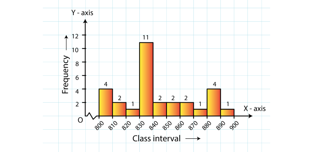
(i) The group that has the maximum number of workers is represented as the highest rectangle. It is in the interval 830−840.
(ii) The number of workers who earn Rs 850 or more can be calculated from frequency table in the following manner:
1 + 3 + 1 + 1 + 4 = 101 + 3 + 1 + 1 + 4 = 10
(iii) The number of workers who earn less than Rs 850 can be calculated from frequency table in the following manner:
3 + 2 + 1 + 9 + 5 = 203 + 2 + 1 + 9 + 5 = 20
RD Sharma Solutions for Class 8 Maths Chapter 24: Download PDF
RD Sharma Solutions for Class 8 Maths Chapter 24–Data Handling - II (Graphical Representation of Data as Histogram)
Chapterwise RD Sharma Solutions for Class 8 Maths :
- Chapter 1–Rational Numbers
- Chapter 2–Powers
- Chapter 3–Squares and Square Roots
- Chapter 4–Cubes and Cube Roots
- Chapter 5–Playing with Numbers
- Chapter 6–Algebraic Expressions and Identities
- Chapter 7–Factorization
- Chapter 8–Division of Algebraic Expressions
- Chapter 9–Linear Equation in One Variable
- Chapter 10–Direct and Inverse Variations
- Chapter 11–Time and Work
- Chapter 12–Percentage
- Chapter 13–Profit, Loss, Discount and Value Added Tax (VAT)
- Chapter 14–Compound Interest
- Chapter 15–Understanding Shapes- I (Polygons)
- Chapter 16–Understanding Shapes- II (Quadrilaterals)
- Chapter 17–Understanding Shapes- III (Special Types of Quadrilaterals)
- Chapter 18–Practical Geometry (Constructions)
- Chapter 19–Visualising Shapes
- Chapter 20–Mensuration – I (Area of a Trapezium and a Polygon)
- Chapter 21–Mensuration – II (Volumes and Surface Areas of a Cuboid and a cube)
- Chapter 22–Mensuration – III (Surface Area and Volume of a Right Circular Cylinder)
- Chapter 23–Data Handling – I (Classification and Tabulation of Data)
- Chapter 24–Data Handling – II (Graphical Representation of Data as Histogram)
- Chapter 25–Data Handling – III (Pictorial Representation of Data as Pie Charts or Circle Graphs)
- Chapter 26–Data Handling – IV (Probability)
- Chapter 27–Introduction to Graphs
About RD Sharma
RD Sharma isn't the kind of author you'd bump into at lit fests. But his bestselling books have helped many CBSE students lose their dread of maths. Sunday Times profiles the tutor turned internet star
He dreams of algorithms that would give most people nightmares. And, spends every waking hour thinking of ways to explain concepts like 'series solution of linear differential equations'. Meet Dr Ravi Dutt Sharma — mathematics teacher and author of 25 reference books — whose name evokes as much awe as the subject he teaches. And though students have used his thick tomes for the last 31 years to ace the dreaded maths exam, it's only recently that a spoof video turned the tutor into a YouTube star.
R D Sharma had a good laugh but said he shared little with his on-screen persona except for the love for maths. "I like to spend all my time thinking and writing about maths problems. I find it relaxing," he says. When he is not writing books explaining mathematical concepts for classes 6 to 12 and engineering students, Sharma is busy dispensing his duty as vice-principal and head of department of science and humanities at Delhi government's Guru Nanak Dev Institute of Technology.