Class 7: Maths Chapter 24 solutions. Complete Class 7 Maths Chapter 24 Notes.
Contents
RD Sharma Solutions for Class 7 Maths Chapter 24–Data Handling – III (Constructions of Bar Graphs)
RD Sharma 7th Maths Chapter 24, Class 7 Maths Chapter 24 solutions
Exercise 24.1 Page No: 24.5
1. Two hundred students of class VI and VII were asked to name their favorite colours so as to decide upon what should be the colour of their school house. The results are shown in the following table.
| Colour: | Red | Green | Blue | Yellow | Orange |
| Number of Students | 43 | 19 | 55 | 49 | 34 |
Represent the given data on a bar graph.
(i) Which is the most preferred colour and which is the least?
(ii) How many colours are there in all?
Solution:
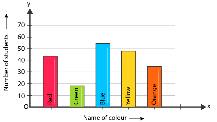
Steps of constructing bar graph:
1. Mark the horizontal axis OX as Name of the Colour and the vertical axis OY as Number of Students.
2. Along the horizontal axis OX, choose bars of uniform (equal) width, with a uniform gap between them.
3. Choose a suitable scale to determine the heights of the bars, according to the space available for the graph. Here, we choose 1 small division to represent 10 students.
(i) The most preferred colour is blue and the least preferred is green.
(ii) In all, there are 5 colours.
2. Following data gives total marks (out of 600) obtained by six children of a particular class.
| Student | Ajay | Bali | Dipti | Faiyaz | Gotika | Hari |
| Marks Obtained | 450 | 500 | 300 | 360 | 400 | 540 |
Represent the data by a bar graph
Solution:
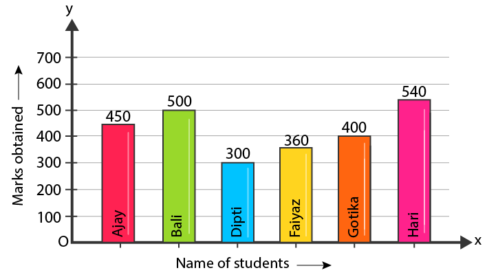
Steps of constructing bar graph:
1. Mark the horizontal axis OX as Name of the Students and the vertical axis OY as Marks Obtained.
2. Along the horizontal axis OX, choose bars of uniform (equal) width, with a uniform gap between them.
3. Choose a suitable scale to determine the heights of the bars, according to the space available for the graph. Here, we choose 1 small division to represent 100 marks.
3. Number of children in six different classes are given below. Represent the data on a bar graph.
| Class: | V | VI | VII | VIII | IX | X |
| Number of Children: | 135 | 120 | 95 | 100 | 90 | 80 |
(i) How do you choose the scale.
(ii) Which class has the maximum number of children?
(iii) Which class has the minimum number of children?
Solution:
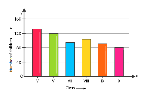
Steps of constructing bar graph:
1. Mark the horizontal axis OX as Class and the vertical axis OY as Number of Children.
2. Along the horizontal axis OX, choose bars of uniform (equal) width, with a uniform gap between them.
3. Choose a suitable scale to determine the heights of the bars, according to the space available for the graph. Here, we choose 1 big division to represent 40 children.
(i) We choose 1 big to represent 40 children.
(ii)The maximum numbers of students are in class V.
(iii) The minimum number of students are in class X.
4. The performance of students in 1st term and 2nd term is as given below. Draw a double bar graph choosing appropriate scale and answer the following:
| Subject: | English | Hindi | Maths | Science | S.Science |
| 1st term: | 67 | 72 | 88 | 81 | 73 |
| 2nd term: | 70 | 65 | 95 | 85 | 75 |
(i) In which subject, has the children improved their performance the most?
(ii) Has the performance gone down in any subject?
Solution:
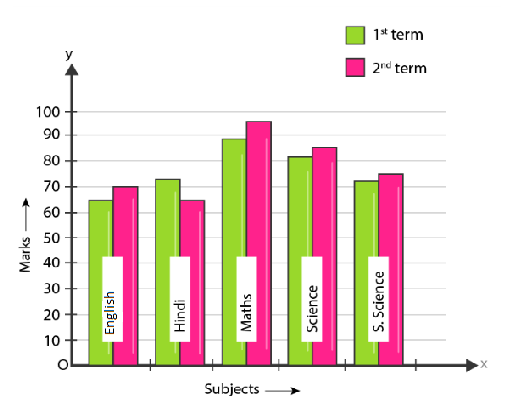
Steps of constructing bar graph:
1. Mark the horizontal axis OX as Subject and the vertical axis is OY as Marks.
2. Along the horizontal axis OX, choose bars of uniform (equal) width, with a uniform gap between them.
3. Choose a suitable scale to determine the heights of the bars, according to the space available for the graph. Here, we choose 1 big division to represent 10 marks.
(i) In Maths, the students showed their greatest improvement.
(ii) The students performed worst in Hindi
5. Consider the following data gathered from a survey of a colony:
| Favourite Sport: | Cricket | Basket – Ball | Swimming | Hockey | Athletics |
| Watching | 1240 | 470 | 510 | 423 | 250 |
| Participating | 620 | 320 | 320 | 250 | 105 |
Draw a double bar graph choosing an appropriate scale. What do you infer from the bar graph?
(i) Which sport is most popular?
(ii) What is more preferred watching or participating in sports?
Solution:
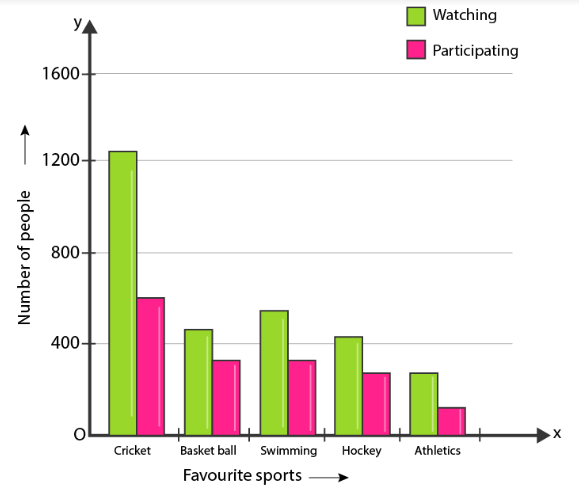
Steps of constructing graph:
1. Mark the horizontal axis OX as Favourite Sports and the vertical axis OY as Number of People.
2. Along the horizontal axis OX, choose bars of uniform (equal) width, with a uniform gap between them.
3. Choose a suitable scale to determine the heights of the bars, according to the space available for the graph. Here, we choose 2 big divisions to represent 400 people.
(i) Cricket is the most popular sport.
(ii)Watching is preferred over participation.
6. The production of saleable steel in some of the steel plants of our country during 1999 is given below:
| Plant | Bhilai | Durgapur | Rourkela | Bokaro |
| Production (In thousand tonnes) | 160 | 80 | 200 | 150 |
Construct a bar graph to represent the above data on a graph paper by using the scale 1 big division = 20 thousand tonnes.
Solution:
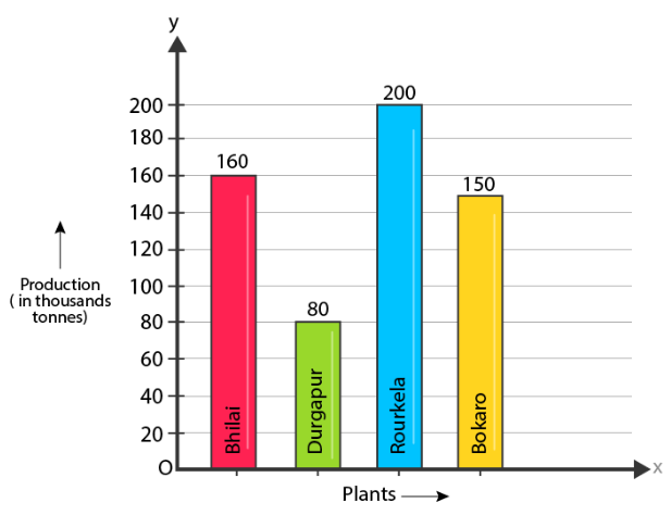
Steps of constructing graph:
1. Mark the horizontal axis OX as Name of the Steel Plant and the vertical axis OY as Production (in thousand tonnes).
2. Along the horizontal axis OX, choose bars of uniform (equal) width, with a uniform gap between them.
3. Choose a suitable scale to determine the heights of the bars, according to the space available for the graph. Here, we choose 1 big division to represent 20 thousand tonnes.
7. The following data gives the number (in thousands) of applicants registered with an Employment Exchange during, 1995-2000:
| Year | 1995 | 1996 | 1997 | 1998 | 1999 | 2000 |
| Number of applicants registered (in thousands) | 18 | 20 | 24 | 28 | 30 | 34 |
Construct a bar graph to represent the above data.
Solution:

Steps of constructing graph:
1. Mark the horizontal axis OX as Years and the vertical axis OY as Number of Applicants Registered (in thousands).
2. Along the horizontal axis OX, choose bars of uniform (equal) width, with a uniform gap between them.
3. Choose a suitable scale to determine the heights of the bars, according to the space available for the graph. Here, we choose 1 big division to represent 4 thousand applicants.
8. The following table gives the route length (in thousand kilometres) of the Indian Railways in some of the years:
| Year | 1960-61 | 1970-71 | 1980-81 | 1990-91 | 2000-2001 |
| Route length (in thousand kilometres) | 56 | 60 | 61 | 74 | 98 |
Represent the above data with the help of a bar graph.
Solution:
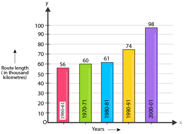
Steps of constructing graph:
1. Mark the horizontal axis OX as Years and the vertical axis OY as Route Length (in thousand kilometres).
2. Along the horizontal axis OX, choose bars of uniform (equal) width, with a uniform gap between them.
3. Choose a suitable scale to determine the heights of the bars, according to the space available for the graph. Here, we choose 1 big division to represent 10000 Km.
9. The following data gives the amount of loans (in crores of rupees) disbursed by a bank during some years:
| Year | 1992 | 1993 | 1994 | 1995 | 1996 |
| Loan (in crores of rupees) | 28 | 33 | 55 | 55 | 80 |
(i) Represent the above data with the help of a bar graph.
(ii) With the help of the bar graph, indicate the year in which amount of loan is not increased over that of the preceding year.
Solution:
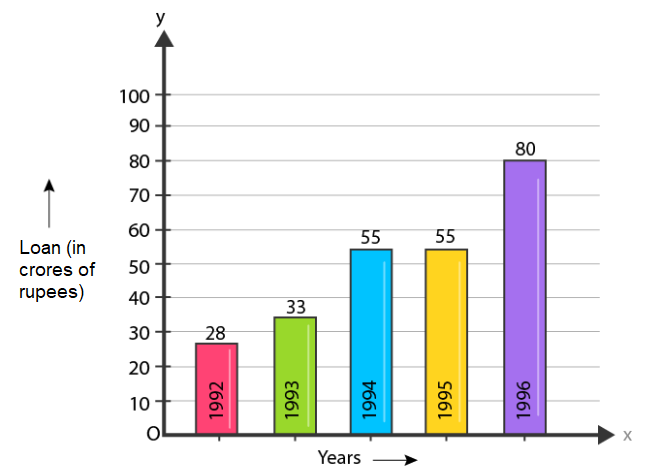
Steps of constructing graph:
1. Mark the horizontal axis OX as Years and the vertical axis OY as Loan (in crores of rupees).
2. Along the horizontal axis OX, choose bars of uniform (equal) width, with a uniform gap between them.
2. Choose a suitable scale to determine the heights of the bars, according to the space available for the graph. Here, we choose 1 big division to represent 10 crores of rupees.
(ii) In 1995, the loan amount was not increased over that of the preceding year.
10. The following table shows the interest paid by a company (in lakhs):
| Year | 1995-96 | 1996-97 | 1997-98 | 1998-99 | 1999-2000 |
| Interest (in lakhs of rupees) | 20 | 25 | 15 | 18 | 30 |
Draw the bar graph to represent the above information.
Solution:

Steps of constructing graph:
1. Mark the horizontal axis OX as Years and the vertical axis OY as Interest (in lakhs of rupees).
2. Along the horizontal axis OX, choose bars of uniform (equal) width, with a uniform gap between them.
3. Choose a suitable scale to determine the heights of the bars, according to the space available for the graph. Here, we choose 1 big divisions to represent 5 lakhs rupees.
11. The following data shows the average age of men in various countries in a certain year:
| Country | India | Nepal | China | Pakistan | U.K. | U.S.A. |
| Average age (in years) | 55 | 52 | 60 | 50 | 70 | 75 |
Represent the above information by a bar graph.
Solution:
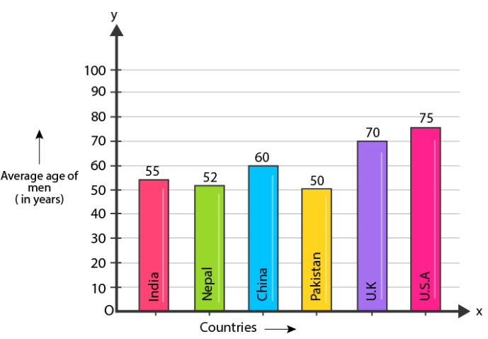
Steps of constructing graph:
1. Mark the horizontal axis OX as Countries and the vertical axis OY as Average Age of men (in years).
2. Along the horizontal axis OX, choose bars of uniform (equal) width, with a uniform gap between them.
3. Choose a suitable scale to determine the heights of the bars, according to the space available for the graph. Here, we choose 1 big division to represent 10 year.
12. The following data gives the production of food grains (in thousand tonnes) for some years:
| Year | 1995 | 1996 | 1997 | 1998 | 1999 | 2000 |
| Production( in thousand tonnes) | 120 | 150 | 140 | 180 | 170 | 190 |
Represent the above data with the help of a bar graph.
Solution:
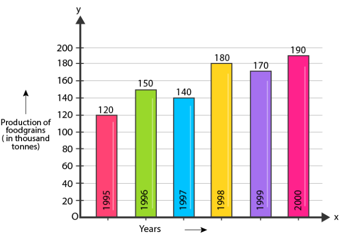
Steps of constructing bar graph:
1. Mark the horizontal axis OX as Years and the vertical axis OY as Production of food grains (in thousand tonnes).
2. Along the horizontal axis OX, choose bars of uniform (equal) width, with a uniform gap between them.
3. Choose a suitable scale to determine the heights of the bars, according to the space available for the graph. Here, we choose 1 big division to represent 20 thousand tonnes.
13. The following data gives the amount of manure (in thousand tonnes) manufactured by a company during some years:
| Year | 1992 | 1993 | 1994 | 1995 | 1996 | 1997 |
| Manure (in thousand tonnes) | 15 | 35 | 45 | 30 | 40 | 20 |
(i) Represent the above data with the help of bar graph.
(ii) Indicate with the help of the bar graph the year in which the amount of manure manufactured by the company was maximum.
(iii) Choose the correct alternative:
The consecutive years during which there was maximum decrease in manure production are:
(a) 1994 and 1995 (b) 1992 and 1993
(c) 1996 and 1997 (d) 1995 and 1996
Solution:
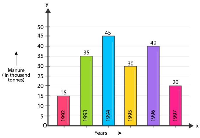
Steps of constructing graph:
1. Mark the horizontal axis OX as Years and the vertical axis OY as Manure (in thousand tonnes).
2. Along the horizontal axis OX, choose bars of uniform (equal) width, with a uniform gap between them.
3. Choose a suitable scale to determine the heights of the bars, according to the space available for the graph. Here, we choose 1 big division to represent 5 thousand tonnes.
(ii) In the year 1994, the amount of manure manufactured by the company was maximum.
(iii) 1996 and 1997.
RD Sharma Solutions for Class 7 Maths Chapter 24: Download PDF
RD Sharma Solutions for Class 7 Maths Chapter 24–Data Handling – III (Constructions of Bar Graphs)
Chapterwise RD Sharma Solutions for Class 7 Maths :
- Chapter 1–Integers
- Chapter 2–Fractions
- Chapter 3–Decimals
- Chapter 4–Rational Numbers
- Chapter 5–Operations On Rational Numbers
- Chapter 6–Exponents
- Chapter 7–Algebraic Expressions
- Chapter 8–Linear Equations in One Variable
- Chapter 9–Ratio And Proportion
- Chapter 10–Unitary Method
- Chapter 11–Percentage
- Chapter 12–Profit And Loss
- Chapter 13–Simple Interest
- Chapter 14–Lines And Angles
- Chapter 15–Properties of Triangles
- Chapter 16–Congruence
- Chapter 17–Constructions
- Chapter 18–Symmetry
- Chapter 19–Visualising Solid Shapes
- Chapter 20–Mensuration – I (Perimeter and area of rectilinear figures)
- Chapter 21–Mensuration – II (Area of Circle)
- Chapter 22–Data Handling – I (Collection and Organisation of Data)
- Chapter 23–Data Handling – II Central Values
- Chapter 24–Data Handling – III (Constructions of Bar Graphs)
- Chapter 25–Data Handling – IV (Probability)
About RD Sharma
RD Sharma isn’t the kind of author you’d bump into at lit fests. But his bestselling books have helped many CBSE students lose their dread of maths. Sunday Times profiles the tutor turned internet star
He dreams of algorithms that would give most people nightmares. And, spends every waking hour thinking of ways to explain concepts like ‘series solution of linear differential equations’. Meet Dr Ravi Dutt Sharma — mathematics teacher and author of 25 reference books — whose name evokes as much awe as the subject he teaches. And though students have used his thick tomes for the last 31 years to ace the dreaded maths exam, it’s only recently that a spoof video turned the tutor into a YouTube star.
R D Sharma had a good laugh but said he shared little with his on-screen persona except for the love for maths. “I like to spend all my time thinking and writing about maths problems. I find it relaxing,” he says. When he is not writing books explaining mathematical concepts for classes 6 to 12 and engineering students, Sharma is busy dispensing his duty as vice-principal and head of department of science and humanities at Delhi government’s Guru Nanak Dev Institute of Technology.
